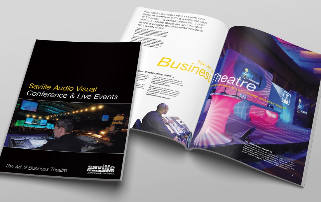
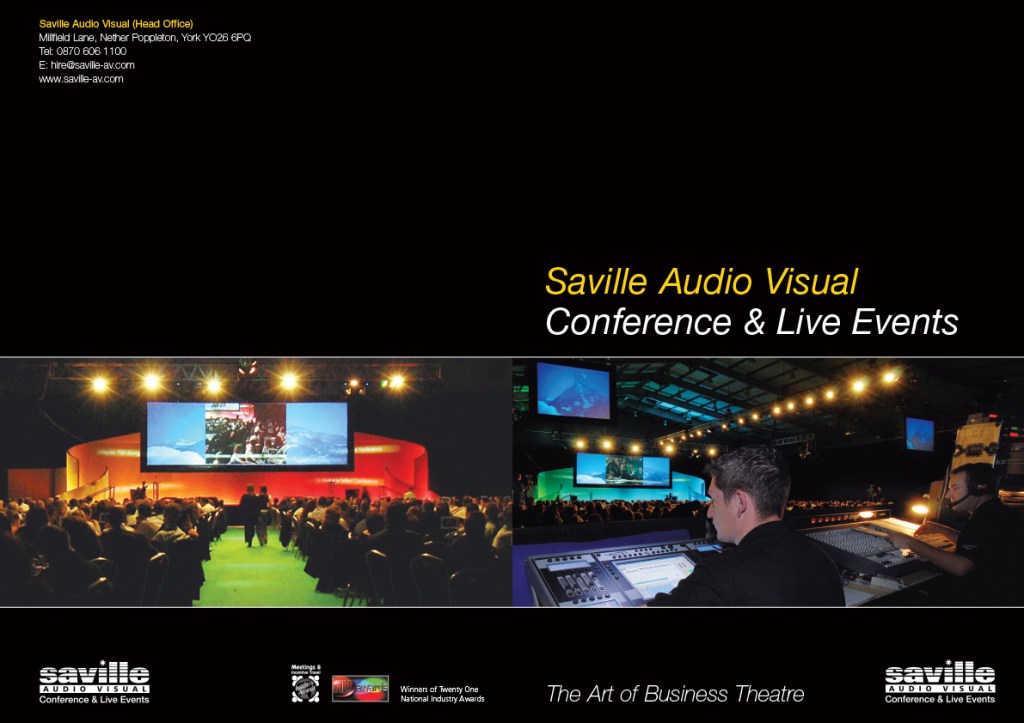
Saville Audio Visual were a multi-award winning AV company, and this was a glossy A4 brochure to promote their live event services to companies of all sizes, and projects of vastly ranging budgets.
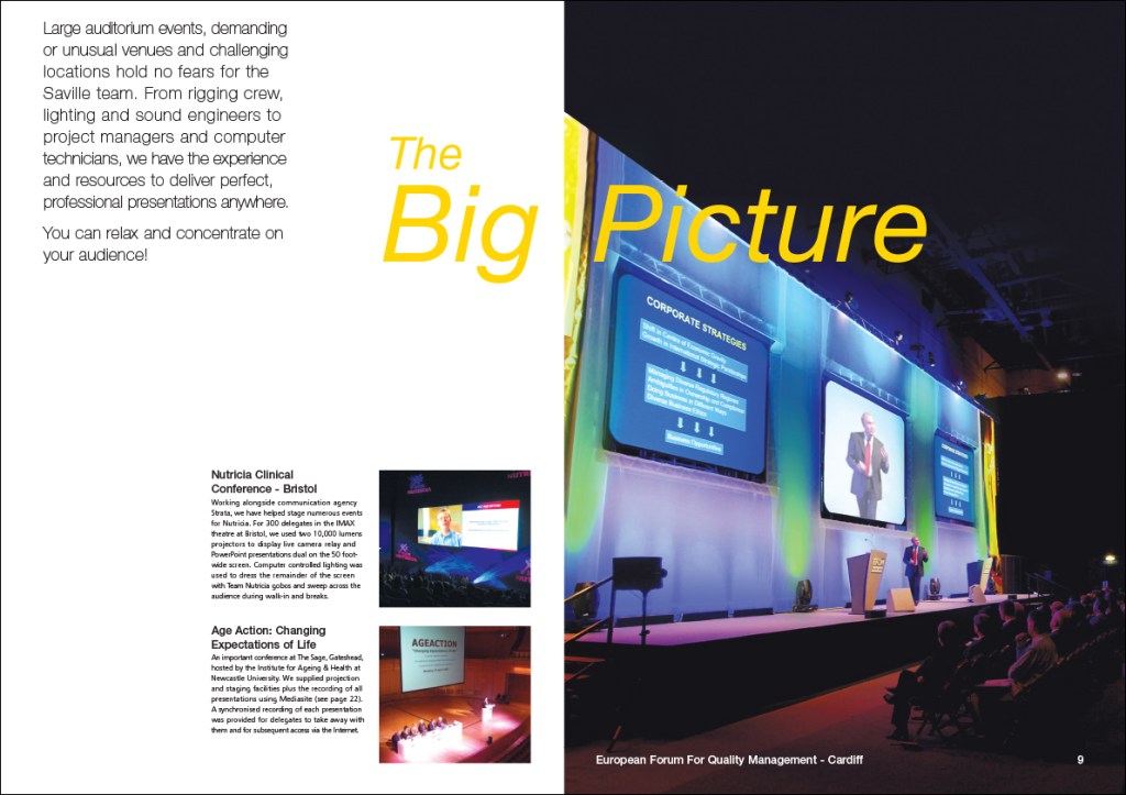
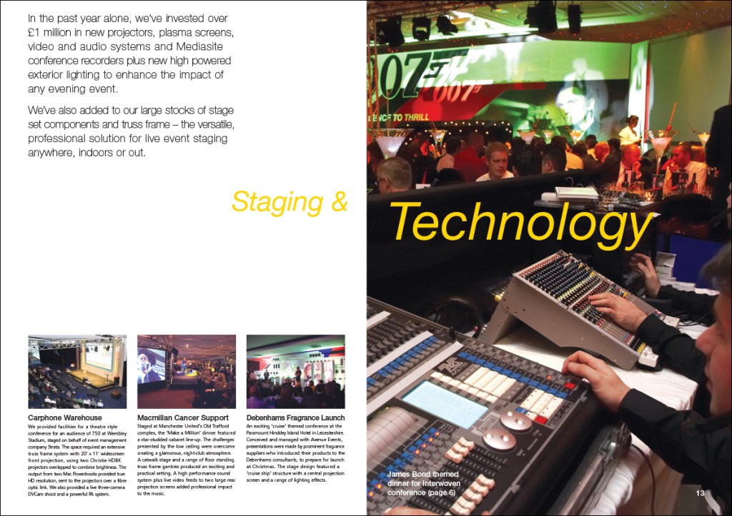
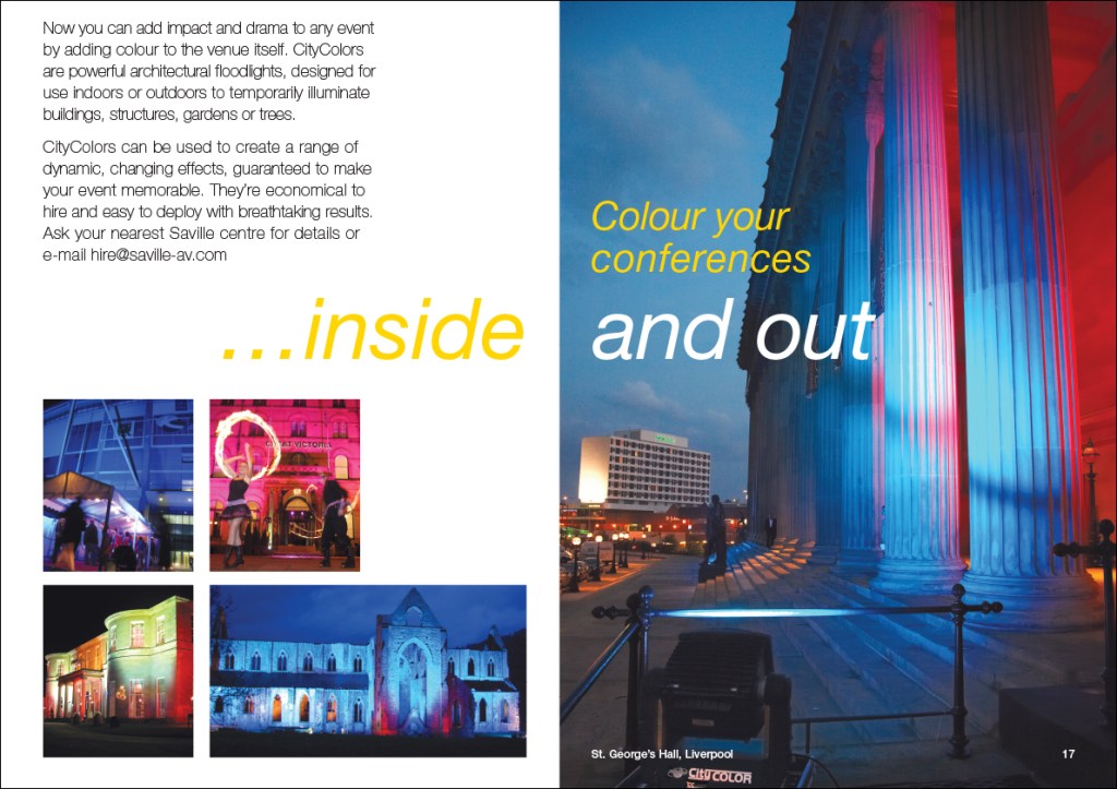
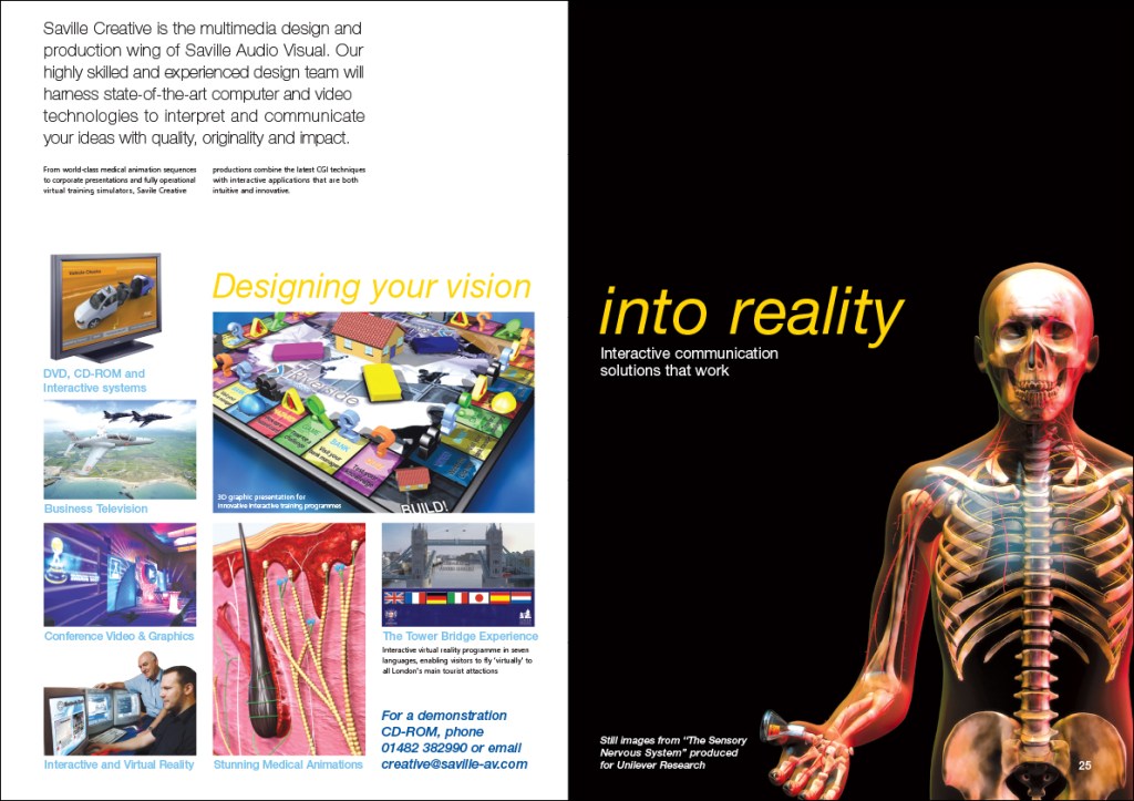
Saville’s print output was largely colourful and corporate, making use of dramatic and bright imagery. I was keen to produce something with a bit more white space, making use of typography. I used full bleed images on the right hand page of each spread, creating a consistent design template and utilising the impactful images. I contrasted this on the left hand pages using the space to draw attention to the message. Where possible, I took the headline across both pages.
I also edited the text, chose the imagery, and in many cases used Photoshop to remove cables, rigging etc. It proved a hit with the sales team, with feedback commenting on how clean and modern it looked. Management were very pleased with the feedback and with the slight alteration to the normal house style. 5000 copies were originally produced but this issue was reprinted when all copies were used.
5000 copies were originally produced but this issue was reprinted when all copies were used
Saville Audio Visual was rebranded as two separate divisions, Sparq, and Visavvi, under the parent company of Saville Group.
Designed on Quark Express and Adobe Photoshop.

