
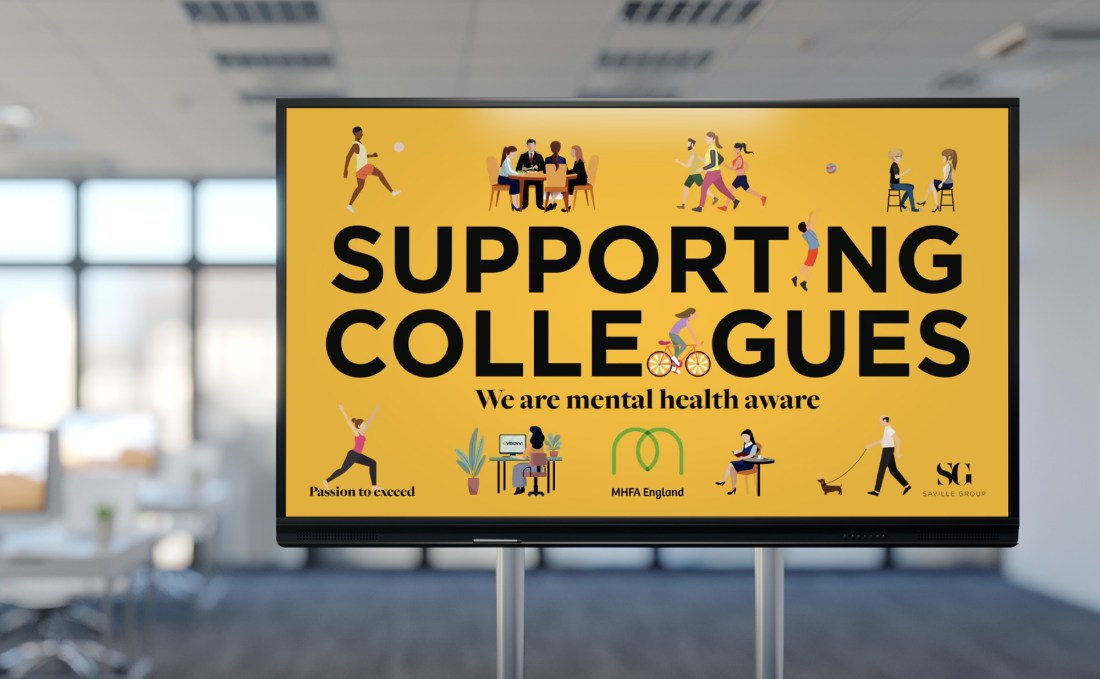
My employer introduced a scheme to promote mental wellbeing in the workplace, and wanted a video clip that would play on a loop on digital signage throughout the company’s branches and on social media.
I had designed the first pull-up stand for SG. We were very happy with the branding, it was impactful, distinctive, and modern, whilst acknowledging the history of the company. It is however, a very corporate brand, with minimal colour and black and white photography.
As this animation was largely intended for internal use, I had a fairly open brief. I chose to utilise the warm colours of the SG branding whilst introducing some colour with some fun, cartoon-style animated elements.
Therefore, this became an opportunity to work within the parameters of the brand whilst evolving and developing it, using elements that we wouldn’t normally use on commercial projects.
I chose simple, flat, illustrated characters that looked informal, and doing things that promote mindfulness, as well as physical and mental wellbeing. There was no more than one animated element per illustration so that the video was engaging without being cluttered or confusing to look at.
It was designed to be viewed on large digital signage screens, so you may wish to watch fullscreen if you want to see the dog’s tail wagging (although I won’t be offended if you don’t). The clip was timed to play seamlessly on a 10 second loop.
The clip was timed to play seamlessly on a 10 second loop
It proved to be a successful campaign, giving employers across the company access to mental health support, both within the company and also externally if required. The animation was also popular, with one colleague commenting on how calming it is to watch.
It is also a good example of a project which subverts and changes the look and feel of a brand, whilst largely complying to its guidelines.
Designed on Illustrator, After Effects, and Media Encoder on the Adobe Creative Cloud suite.
