
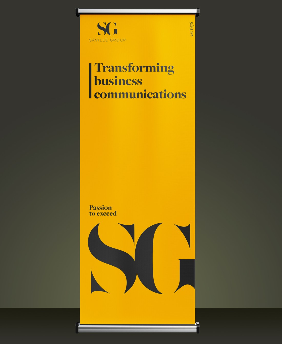
Pull-up stand for the relaunch of a nationwide audio visual company with a global client base.
SG is the umbrella company for four other brands. It is not client facing, and doesn’t sell anything as such. This pull-up stand was also not intended for any specific use. Therefore, no imagery was necessary and a generic solution was required, whilst utilising the brand’s strong and distinctive aspects.
The general tone of the brand is warm, approachable and traditional. This design hints at a modern and contemporary feel with the large SG bled off to the right, and the vertical “est 1876” and minimal layout. The vertical line to the left of the headline was also new, and an element we incorporated into the brand for future projects.
This design hints at a modern and contemporary feel
The finished sign was clean yet striking, and was used at numerous events, launches, or as a “welcome” sign for visitors to head office.

Designed on InDesign on the Adobe Creative Cloud suite.
