

For twelve years, I designed the annual company Report & Accounts document for SEA Holdings, the parent company of my employer.
The only real stipulation of the brief was that the design would not adhere to the corporate style of the three companies that SEA Holdings represented.
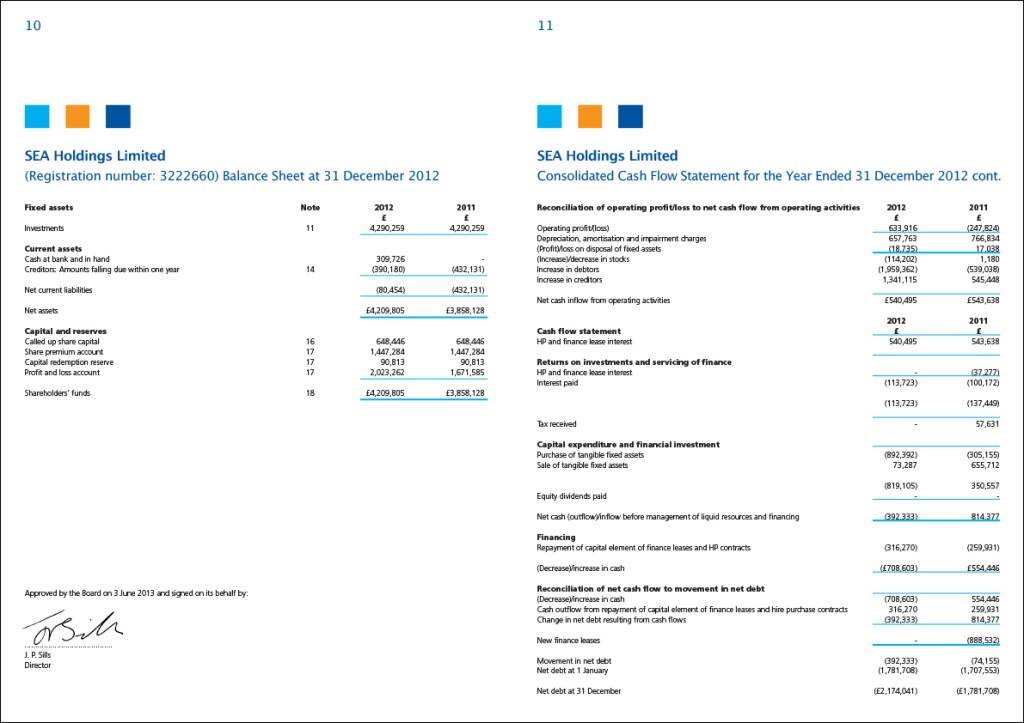
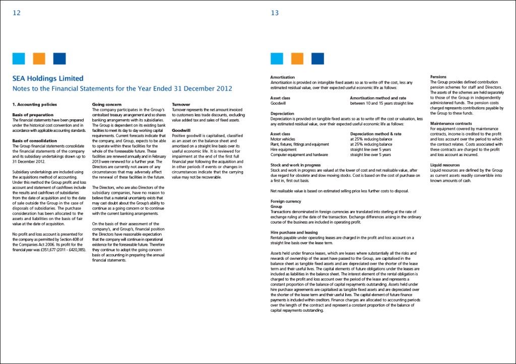
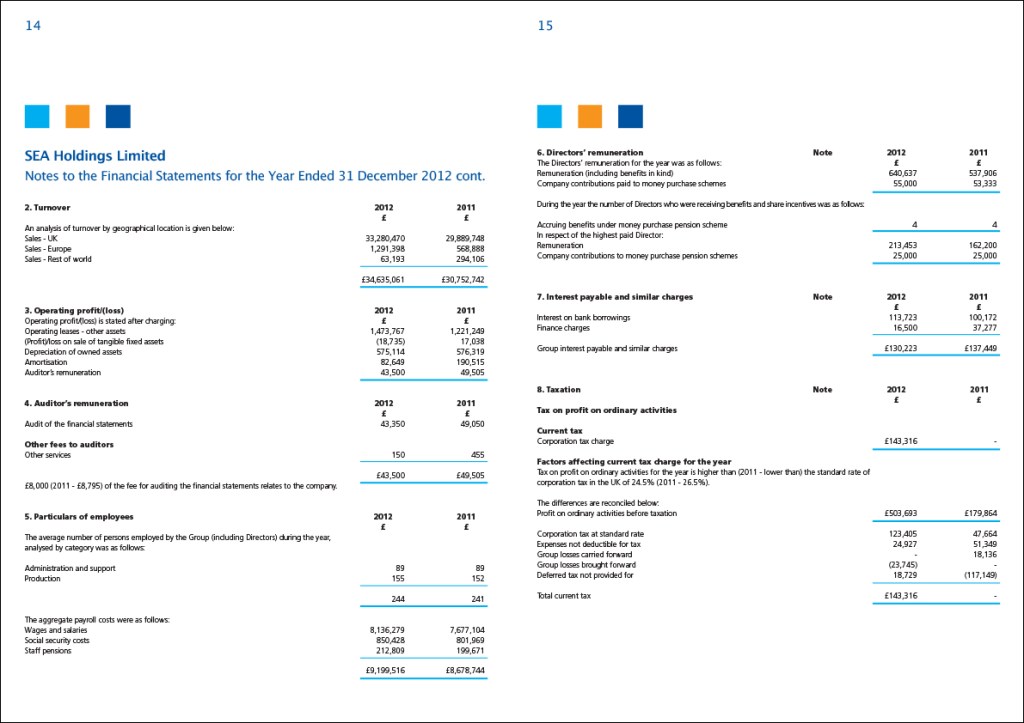
Of course, it was also necessary that the accounts be clearly laid out and accurate, and that the reports look professional and representative of what it’s companies do.
Because this is an informative document and not a sales tool, I chose to use black and white imagery. It breaks up the information, making it more palatable to read, whilst not detracting from the text. The three coloured blocks used throughout represent the main colour of each of the three companies, and the use of minimal colour helps to break up the hierarchy of information.
The three coloured blocks used throughout represent the main colour of each of the three companies
I enjoy the discipline of tackling a bit of serious information typography! My manager was on holiday when I did this, and he was delighted to see the finished printed document on his return!


Designed on Quark Express and Adobe Photoshop, printed on A3 folded to A4.
